
Panopticon is a purpose-built life status display that currently hangs on my bedroom wall. It has been my primary project for a little over the past year. (The Github commits start around October 2014, but I’d been laying out the spec for a while before that.) The seed of the idea was planted in my mind when I saw this reddit post and realized that I could make cheap, thin, affordable, high-density displays with the many old laptops I had. I also had a Raspberry Pi, which I was unable to find a use for since I bought the thing at release day.

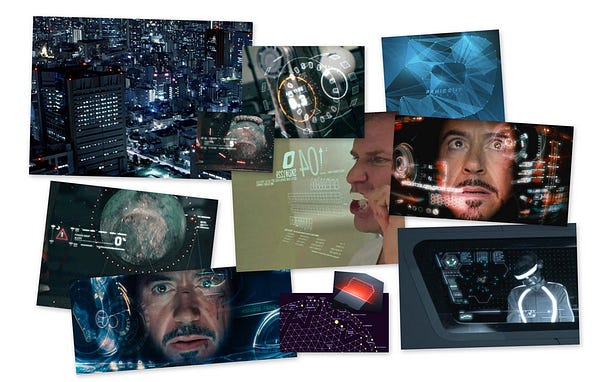
Anand Sharma’s sources of inspiration. Pic belongs to him, of course
Around this time, Anand Sharma made his quantified-self tracker, April Zero, publicly visible. When designing it, he took deliberate inspiration from the user interfaces of sci-fi movies, namely Iron Man.
I was awestruck, not just by the effective aggregation of data, but also by how nicely it was presented.
I could not get the idea out of my mind. After two weeks, I decided I absolutely had to make my own. I had a fairly good idea of what I wanted — a display that would hang on my wall and show relevant information (such as my upcoming schoolwork, calendar events, the weather, and so on.)
I began gathering inspiration. Like April Zero, I wanted the system to look as sleek and futuristic as possible. Building something to resemble the UIs of sci-fi movies has been a fantasy of mine for a long time, and this was the perfect excuse to design exactly what I wanted.

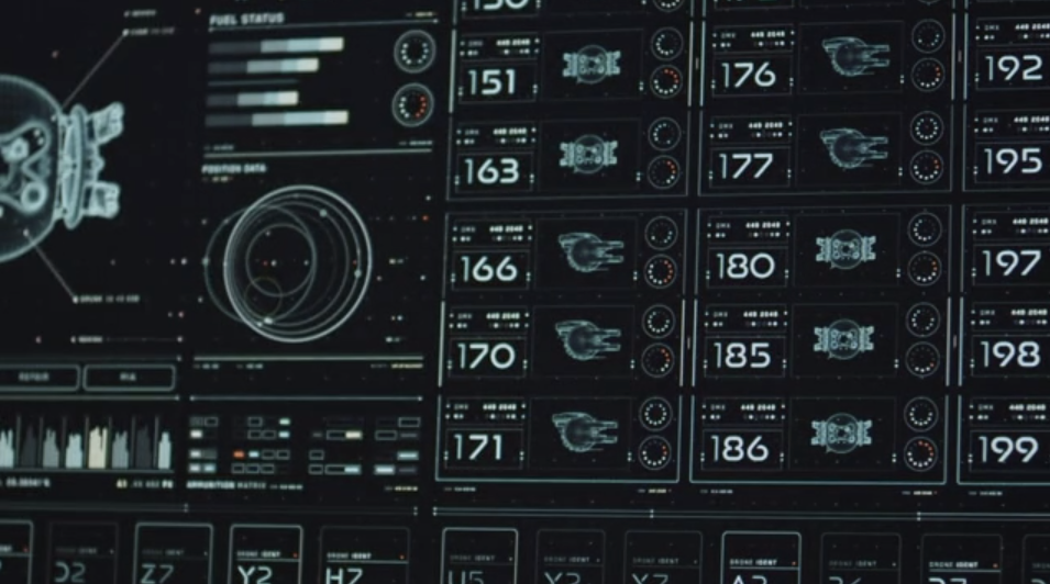
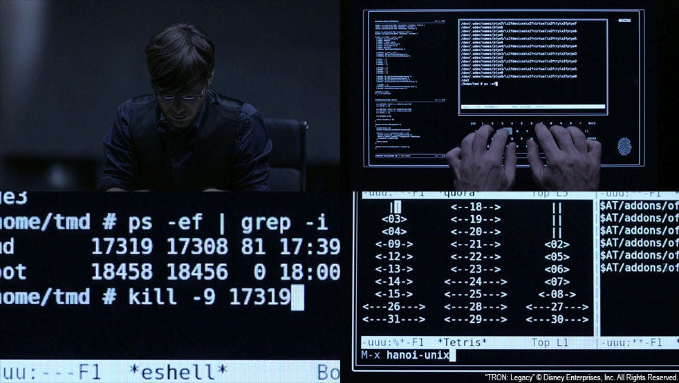
GMUNK’s work on Oblivion (left) and TRON Legacy (right).

I took inspiration from several sources — April Zero itself, Her, Pacific Rim, Person of Interest, and the new Star Trek reboot — but no designer was as big a source of inspiration as GMUNK. His work on TRON Legacy and Oblivion, among others, were some of the first film GUI designs that made me realize that I loved exactly how awesome these creations were, even if they were only on screen for a few dozen frames.
I wanted the internals to be modular, so that I could easily add or remove status displays without tearing the whole system apart. To that end, each panel is its own independent system that loads its own structure, styles, and scripts.
After an hour or two, I had a working base system that would load and display modules. At this point, ideas for data sources began coming in: